 .
.The following are some common properties used on various objects. They make up the core set of properties for many other objects. Properties specific to an object are documented in that object's documentation. Events properties are detailed in the "About Events" topic.
Common Standard and Advanced Properties
Accelerator
This allows you to define the letter to use in conjunction with the Alt
key to create an accelerator for the control. The letter or symbol defined
should be unique from those used for other accelerators (including the
accelerators on the menu bar). This is used with most form controls.
Alignment
Text alignment within the text object’s defining rectangle.
AnchorSnaps
Field that allows you to create, delete or modify snap points in the Enter Snap Points dialog box. Snap points are
found on the ellipse, rectangle, text box, or bitmap image objects.
You can connect Line or Polyline objects to an object's snap points by dragging the tip of the line onto the displayed blue snap point.
Once connected, when you drag the object to a new location, the resulting line remains connected to the snap point, rotating, elongating, and shrinking as necessary. This feature is helpful when you need to create a "leader-line" that constantly points to an object that you'll frequently be moving.
To
display snap points, from the Layout toolbar
click the View Snap Points icon .
Auto Size
This determines whether or not the object sizes itself automatically based
on the length of the text it contains.
If this is set to YES and Word Break is set to NO, then the text object automatically adjusts its width.
If this is set to YES and Word Break is set to YES, then the text object automatically adjusts its height.
BackColor
Background color of the object. This color is used to fill the object’s
defining rectangle.
Nil - This stands for no value. It means the background will be transparent, allowing other colors of objects behind this object to show through. By default, anything with a BackColor property is set to Nil.
Setting the color to Nil sets the color to RGB(255,255,254) which is then made transparent within the Report window.
If you try to specify a color of RGB(255,255,254), PC-DMIS automatically sets it to RGB(255,255,255), a non-transparent color. This does not affect how the object is displayed.
Be aware that if your label has a bitmap image that uses the color RGB(255,255,254), PC-DMIS sets that color to transparent inside the Report window.
BorderStyle
Style of border drawn around the object.
Bottom
Distance, in pixels, of the bottom of the object’s rectangle from the top
of the template or form.
CursorPointer
Cursor displayed when the user drags the mouse over the object.
Enable
Enable or disable the object. A disabled object may still be visible, but
does not respond to user input.
Font
Font used for text rendered in the object.
ForeColor
Foreground color of the object. In the case of the text object, specifies
the text color.
Group
This is used with form objects, such as buttons, check boxes, radio buttons
and so on.
HatchStyle
This sets the type of pattern (or hash) to use to with the object. Available
patterns are:
Horizontal

Vertical

Diagonal

Reverse Diagonal

Cross

Diagonal Cross

Objects that use this include: Border, Ellipse, Histogram, TextVar
HelpContextID
This is the context ID of a specific help topic to call. This is often
used in conjunction with the Help button type which invokes WinHelp(
).
Layer
This assigns the current object to the selected layer.
Left
Distance, in pixels, of the left side of the object’s rectangle from the
left side of the template or form.
LineStyle
This changes the objects line style (or border style) to Solid,
Dash, Dot,
Dash-dot, and Dash-dot-dot.
LineWidth
This sets the line's (or border's) width in pixels.
(Object
Code)
Unique name that identifies an object in a template or form. Whenever you
need to access a property or method of an object using the BASIC language,
use the following syntax:
{Object Code}.{property or method name}
Orientation
Orientation of the text inside the object. Horizontal text flows from left
to right. Vertical Up flows from bottom to top. Vertical Down flows from
top to bottom.
Padding
This property adds pixels of white space around the text by the given amount.
PC-DMIS
Commands
(Appears only for objects added to the Custom Report Editor)
Adds or Removes command references to existing objects in your report. Select an object in your report, and select this property. The PC-DMIS Commands dialog box appears.
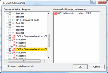
PC-DMIS Commands dialog box
By default, all the commands in your measurement routine appear in the expandable and collapsible list on the left. However, for some objects, namely the Label object, GridControlObject, Analysis object, and DimensionHistogram object, some commands may not be valid. In those cases they are disabled in the list. You can choose to hide any disabled commands in the left-hand list by selecting the Show only valid commands check box.
The right-hand list displays all the commands referenced by the object.
Select the commands from the left-hand list that you want the selected object to reference. PC-DMIS displays them in the right-hand list if the object supports taking multiple commands. However, in most cases, you can only select one command.
Click OK. The dialog box closes and PC-DMIS now references the new command in the selected object.
This essentially provides an alternate approach to updating an object to use different data from the measurement routine. See "Dragging and Dropping Information into a Custom Report" for the usual way of updating objects.
For the CADReportObject or the AnalysisObject, features whose check boxes are marked are added to the object. Features whose check boxes are cleared are removed from the object. If nothing is marked, PC-DMIS displays items according to the HideAllPointsonReport and HideAllMeasuredFeaturesOnReport registry entries in the Reporting section of the PC-DMIS Settings Editor.
For objects that support multiple commands (such as the GridControlObject), this dialog box lets you change the order of referenced commands.
PC-DMIS References
(Appears only for objects added to the Custom Report Editor)
Tracks the commands referenced by the selected reporting object. During report generation, for each command, PC-DMIS checks the command references of each object. If that object indicates that it has a reference to the command being processed, PC-DMIS sends the command data to that object.
Most objects only support one command at a time, but some objects can support data from multiple commands (such as the GridControlObject). If you drag and drop commands into the Custom Report Editor, PC-DMIS takes care of managing the references for you internally. You should only need to use this property if you decide to have manual control over which commands are referenced for some reason.
PenWidth
Width of the pen used to draw the object. In the case of the text object,
the pen width only affects the border drawn around the text.
Right
Distance, in pixels, of the right side of the object’s rectangle from the
left side of the template or form.
ShadowStyle
This sets the location of the 3D shadow on the resulting object. Available
locations are:
Top/Left, Bottom/Right, or None
Tag
Place holder that stores user-defined data.
Text
Text appearing in the text object. You can also type an ampersand symbol
(&) in front of any alphanumeric character in this field to create
a shortcut key (shown as an underlined character). Once defined, you can
press the key along with the Alt key in run
mode to cause that control to immediately have the focus. If you plan
on using a lot of shortcut keys, you can ensure they are unique by using
the Edit | Layout | Check Mnemonics menu item
in edit mode.
Tabstop
This determines if pressing the Tab key cycles to the object. This is used
with form objects, such as buttons, check boxes, radio buttons and so
on.
ToolTipText
Text displayed when you move the mouse over the object inside run mode.
Top
Distance, in pixels, of the top of the object’s rectangle from the top
of the template or form.
ValueID
This contains the value of the ID, or on supported objects it contains
the CurPage and NumPages
variables. You get and set this property using the control. This is used
with most of the form objects.
Visible
Visibility state of the object. A value of 1
corresponds to visible, 0 to hidden.
Word Break
Determines whether or not the text object can hold more than one line of
text. If set to YES, then PC-DMIS wraps
text strings that exceed the width of the object container within the
object container. If set to NO, then
text strings remain on a single line.